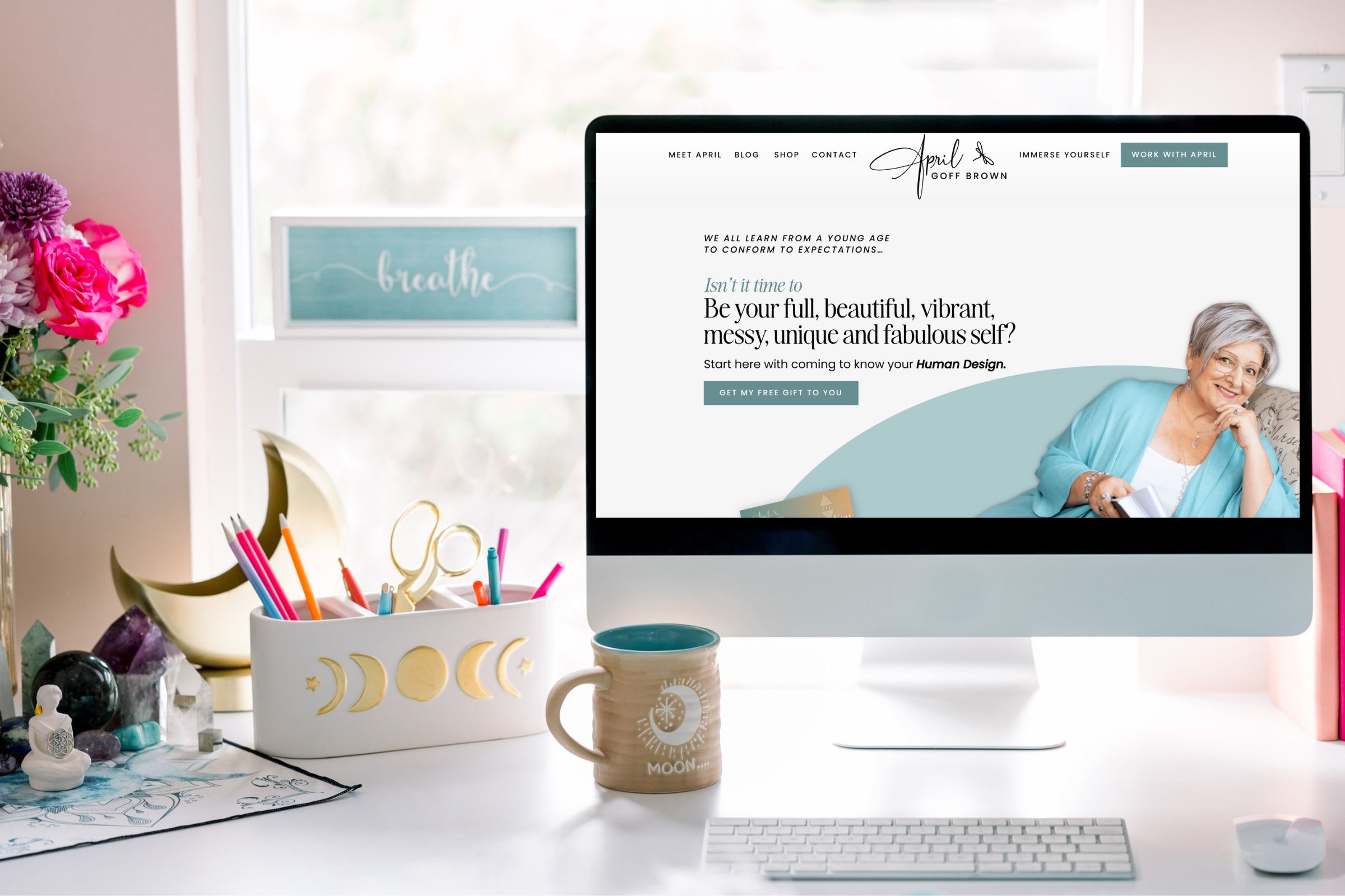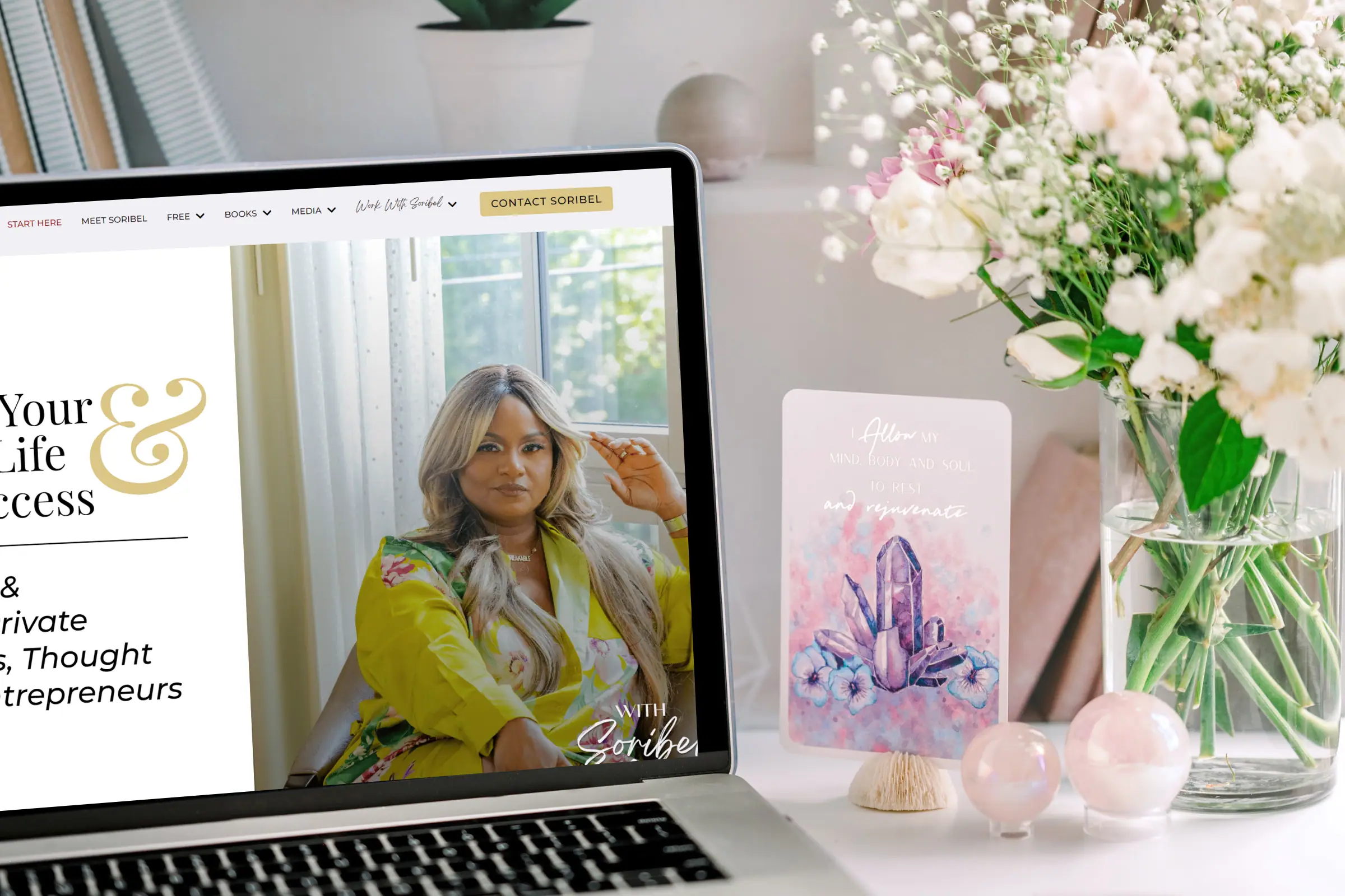
You know that feeling when you land on a website and something just feels… off? Maybe it’s cluttered, maybe it’s overwhelming, or maybe you just can’t figure out where to look first.
That’s what happens when design isn’t intentional.
I’ve worked with enough coaches and visionary entrepreneurs to know that most don’t set out to create a confusing website or sales page. But without a clear strategy behind the visuals, that’s exactly what happens. And it costs you clients.
Bad design isn’t always what you think
When most people think “bad design,” they picture visual chaos—clashing colors, too many fonts, images everywhere. And yes, that’s a problem.
But there’s a quieter issue that’s just as damaging: the absence of intentional design.
Your website or sales page might look fine at first glance, but if it doesn’t guide someone naturally from curiosity to action, it’s not doing its job.
Visual marketing is about more than looking good
Here’s the thing: your website isn’t just there to look pretty. It’s there to communicate, connect, and move people forward.
When design is intentional, it organizes information in a way that makes sense. It helps your soul clients understand what you do, why it matters, and what to do next—without having to work for it.
What intentional design actually looks like
Think of your website and sales page as a map. They should guide your visitor from “I’m curious” to “I’m ready” without them getting lost along the way.
Here’s what makes that happen:
Break down your text. Large blocks of text are intimidating. No one’s reading all of that. Break it into shorter paragraphs, use bullet points for key info, and add headings that make it easy to scan.
Create visual hierarchy. The most important things should stand out. Use size, color, and spacing to guide someone’s eye to what matters most.
Give your content room to breathe. White space isn’t wasted space—it makes everything easier to read and helps your message land.
People skim. Design for that.
Studies show we now have the attention span of a goldfish. (Maybe less, honestly.)
Most people aren’t reading every word on your page. They’re scanning for what matters to them. If your design doesn’t support that, they’ll miss your message entirely.
When you design with skimmability in mind, even the people who don’t read everything will still walk away understanding what you do and how to work with you.
Where most website and sales page designs go wrong
Text overload. Long, unbroken paragraphs guarantee your content gets skipped. Use subheadings, lists, and visuals to keep people engaged.
Visual overload. Yes, visuals matter. But too many images or graphics just distract from your message. Every visual should have a purpose.
Ignoring mobile users. A huge chunk of your audience is viewing your site on their phone. If your design doesn’t work on mobile, you’re losing people.
Design shifts beliefs and overcomes objections
Intentional design is persuasive. It shifts beliefs and moves people forward.
A strategically placed testimonial builds trust. A clear, bold call to action drives conversions. The way you present your offer can be the difference between “maybe later” and “yes, now.”
Practical ways to improve your website and sales page design
Embrace white space. It prevents your page from feeling cluttered and helps key elements stand out.
Keep your branding consistent. Your fonts, colors, and imagery should align with your overall brand. Consistency builds trust and recognition.
Make your call to action impossible to miss. Use contrasting colors, clear fonts, and compelling language. Don’t make people hunt for the next step.
Use visuals to tell a story. Images, infographics, and videos can convey complex ideas quickly and keep people engaged.
If your website or sales page isn’t converting, look at the design
If people are landing on your site but not booking calls, signing up, or buying—take a close look at your design.
Are you making it easy for them to navigate? Is your message clear? Are you guiding them toward action, or are they left wondering what to do next?
Design isn’t an afterthought. It’s the foundation that makes everything else work.
The bottom line
In online marketing, every detail counts. And design? It’s one of the most important details.
When your website design and sales page design are intentional, they become powerful tools for conversion—attracting the right people, connecting with their needs, and guiding them toward working with you.
Next time you’re working on your site or sales page, ask yourself: Is this guiding someone toward action? Or is it just taking up space?
Good design creates an experience that makes saying yes feel easy. And that’s what turns visitors into clients.